product design & data viz
Designing the space between information and human judgment.
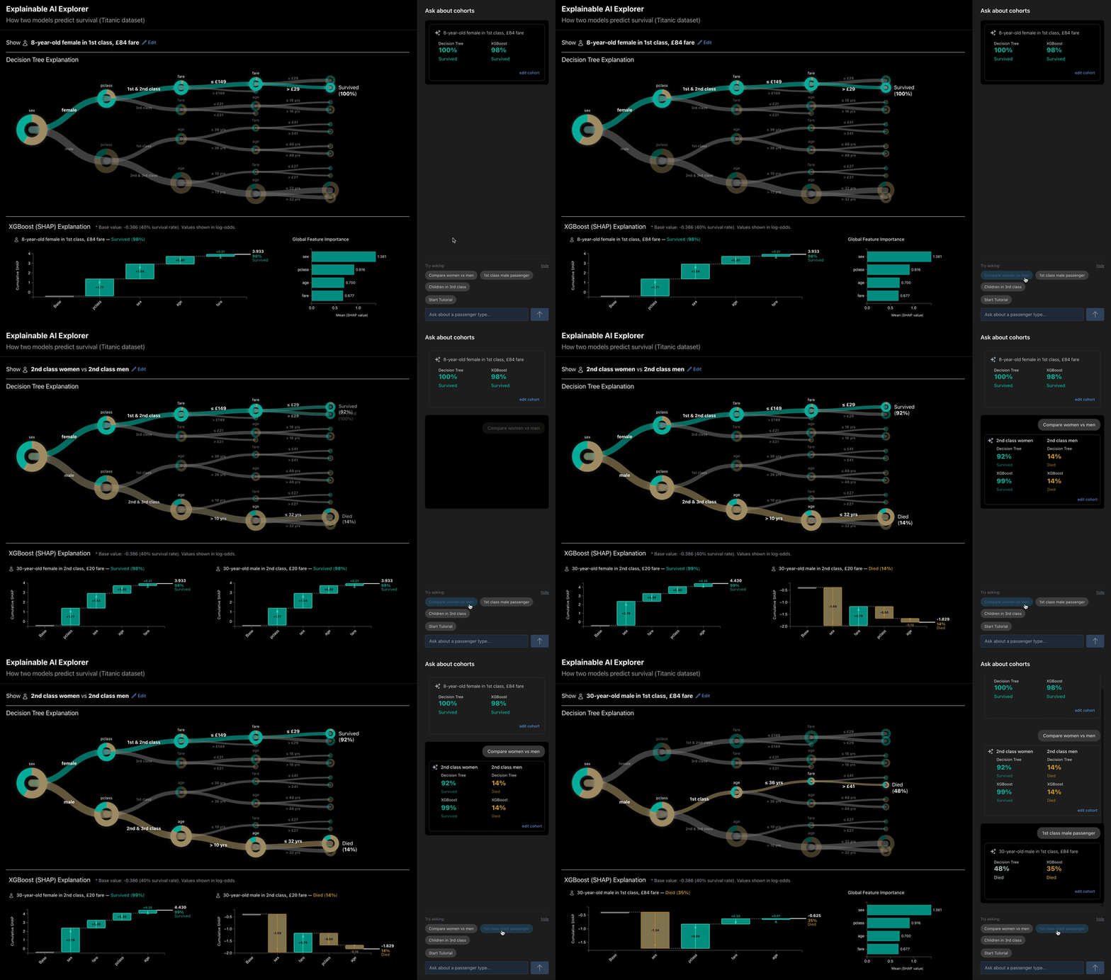
A design exploration of how interaction and visualization can help people inspect, compare, and reason about AI predictions — side-by-side model comparisons, SHAP visualizations, and a structured conversational layer for cohort analysis.
An audit interface for reviewing a language model’s screening decisions on 832 research abstracts — directing human attention to the calls most likely to need review, rather than reviewing every one in sequence.

An interactive citation graph mapping how closely AI-explanation research and design’s comprehension research actually cite each other — making the pattern something you can see and explore, rather than just state.

An internal financial dashboard that brings scattered fund data into one place, balancing quick reference with deeper performance and comparative analysis.

A master’s thesis exploring how explanations can become interactive—helping people understand music recommendations and use descriptive attributes to refine them.

Explore the hidden relationships between Academy Award categories.
Built with Claude Code and Cursor.

Is LEGO going gray? How color palettes shift as more Lego sets target adults.
Built with GitHub Copilot and Cursor.

Hi, I'm Juliana.
I’m a product and data visualization designer. My work is about the moment someone has to decide whether to trust what a system is telling them — a model’s prediction, an assistant’s answer, a number they’re about to act on — and the interface that lets them verify it.
Most of that work has been enterprise: analytical tools, dashboards, and the design systems behind them, with work for Goldman Sachs, JPMorgan Chase, Morgan Stanley, and ADP.
I build working prototypes, mostly in code, because much of what I design is behavior — how a chart adapts as its container changes, how an explanation holds up when you interrogate it, where a review queue should send your attention first. Some questions only answer themselves once the thing runs.
To get in touch, email me at email me.